


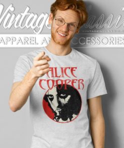
Alice Cooper

Alice Cooper

Alice Cooper


Alice Cooper

Alice Cooper
The stage persona behind the graphics
Alice Cooper’s graphic identity centers on the contrast between hard-rock imagery and theatrical horror. The dark eye makeup makes portrait designs immediately recognizable, while jagged lettering, stark shadows and unsettling characters extend that stage persona into poster-like artwork. Some designs keep the composition spare, using little more than a face, name and limited color palette. Others surround the figure with snakes, graveyard imagery or comic-style scenes for a more elaborate shock-rock treatment.
That difference matters when choosing a design. A high-contrast portrait places the emphasis on Alice Cooper as a performer and usually reads clearly from a distance. More detailed illustrations emphasize atmosphere instead, drawing attention to the nightmare, pulp-horror or theatrical side of the music.
How album references change the visual direction
Album- and song-based graphics provide several distinct approaches. School’s Out supports school emblems, rebellious slogans and distressed red lettering. Welcome to My Nightmare shifts toward dark theatrical framing, while Constrictor introduces coiled-snake imagery. Designs referencing From the Inside may use cold-toned, psychologically intense portraiture, whereas Hey Stoopid can take a brighter route through oversized lettering and vivid color.
Tour-style graphics differ from album-centered designs by presenting the artwork more like concert promotion. They may combine a central portrait with dates, anniversary wording or display typography, but those details belong to the individual design and should not be treated as proof that every garment reproduces a historical tour shirt.
For a vintage-style Alice Cooper design, distressed type, restrained colors and period-inspired layouts provide the visual character without implying that the garment itself is an original vintage item. A specific album title makes the musical reference more focused; a portrait or logo keeps the connection broader; and nightmare, snake or graveyard imagery puts the theatrical horror element first.