

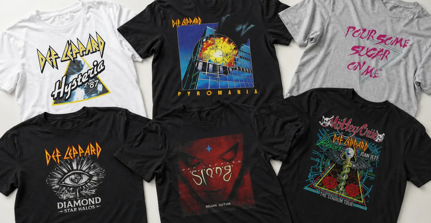
Def Leppard Shirts
Def Leppard shirts translate the band’s angular logo, album artwork and arena-rock imagery into graphics ranging from clean wordmark prints to densely layered tour layouts. Pyromania, Hysteria, Adrenalize and Diamond Star Halos provide distinct visual directions, while song-based designs use recognizable titles such as “Pour Some Sugar on Me,” “Love Bites” and “Rock of Ages” as the central statement.

Def Leppard

Def Leppard

Def Leppard

Def Leppard

Def Leppard

Def Leppard

Def Leppard

Def Leppard

Def Leppard


Def Leppard

Def Leppard

Def Leppard

Def Leppard

Def Leppard

Def Leppard

Def Leppard

Def Leppard

Def Leppard

Def Leppard

Def Leppard

Def Leppard

Def Leppard

Def Leppard

Def Leppard

Def Leppard

Def Leppard

Def Leppard

Def Leppard

Def Leppard
Album artwork defines the major design directions
Def Leppard album shirts are not variations on a single visual formula. Pyromania lends itself to tightly framed artwork with geometric architecture, a fiery focal point and strong blue, yellow and orange contrast. Hysteria designs often emphasize triangular framing, bright line work or oversized lettering, giving the graphics an unmistakably late-1980s visual character. The circular symbol associated with Adrenalize creates a more centered, emblem-like composition.
Later releases introduce different imagery without losing the angular Def Leppard wordmark. Slang supports darker red-and-black portrait treatments, while Diamond Star Halos can be represented through an eye, radiating lines and celestial details. These distinctions make an album design useful for expressing attachment to a particular record as well as to the band generally.
Logos, songs and leopard motifs
A logo shirt is the most direct option. The sharply pointed Def Leppard lettering can stand alone or sit above a small emblem, producing a cleaner composition than full album artwork. Some graphics play on the band name through leopard imagery, including spotted cats, sunglasses or neon treatments. These designs shift attention from a specific release toward the visual pun built into the name.
Song-centered shirts take another route by making a title the primary graphic. “Pour Some Sugar on Me” works naturally as bold handwritten text, while “Love Bites,” “Rock of Ages” and “Foolin’” can appear as typography, illustrated concepts or references within a larger Hysteria or Pyromania design. This format is distinct from a general album shirt because the song reference remains the central idea.
Tour graphics and retro print language
Def Leppard tour shirts typically use the visual density of a concert poster: stacked names, portraits, printed years, geometric borders and multiple lines of event-style text. Stadium-tour treatments may add elaborate central illustrations and references to other performers, while simpler world-tour graphics keep the band logo dominant. The result is usually busier and more commemorative-looking than a standalone wordmark.
Black garments provide strong contrast for electric blue, red, yellow, white and neon artwork, while white or gray shirts give bright typography a lighter presentation. Faded color, distressed texture and historical dates can create a retro appearance, but those elements describe the graphic style rather than proving that a shirt was produced during the year shown. For a visually restrained choice, prioritize the wordmark or one song title; for greater detail, look to album covers and layered tour-style compositions.