

Bring Me The Horizon Shirts
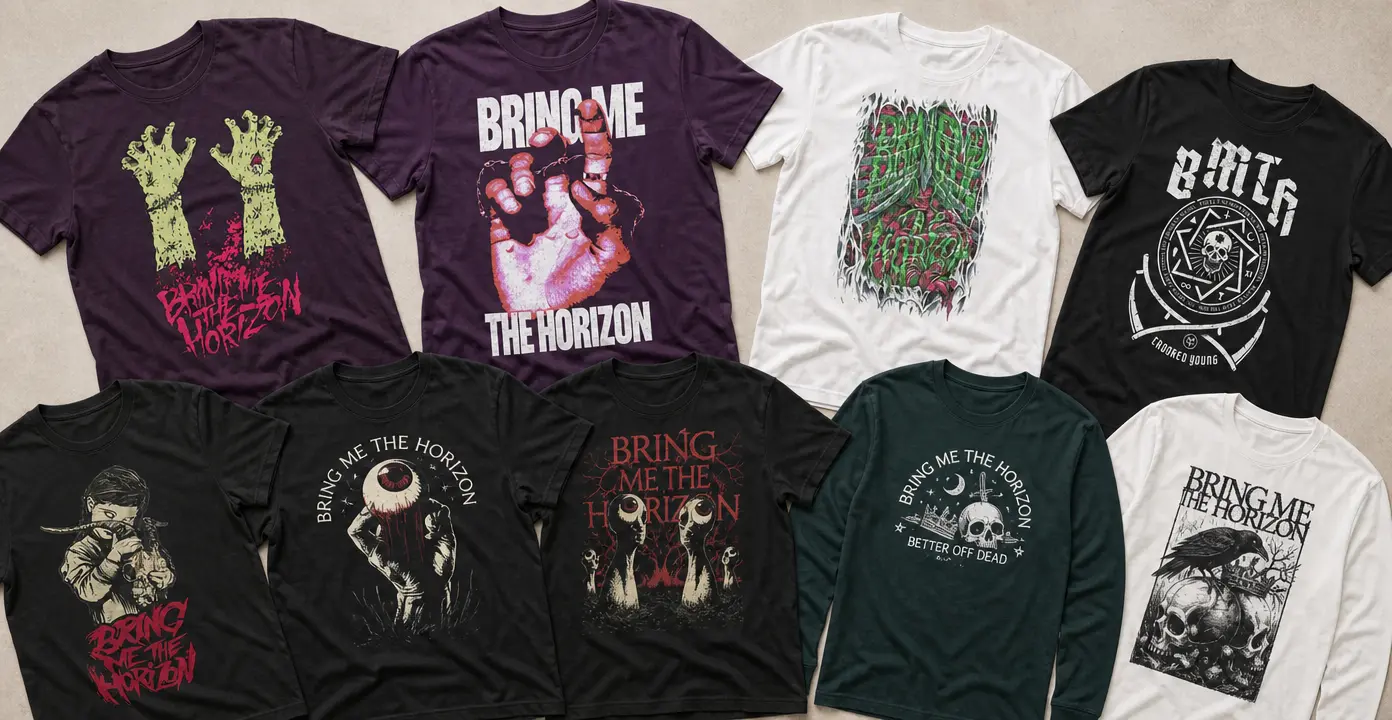
Bring Me The Horizon shirts translate the band’s heavy, shape-shifting identity into distressed logos, stark emblems, and macabre illustrations. The observed designs lean into zombie hands, staring eyes, skulls, ravens, and visceral typography, while cleaner BMTH initials and band-name treatments offer a more restrained direction. Dark garments intensify the horror imagery; white shirts give detailed black artwork a poster-like contrast.

Bring Me The Horizon

Bring Me The Horizon

Bring Me The Horizon

Bring Me The Horizon

Bring Me The Horizon

Bring Me The Horizon

Bring Me The Horizon

Bring Me The Horizon

Bring Me The Horizon

Bring Me The Horizon

Bring Me The Horizon
From band emblems to full horror illustrations
Bring Me The Horizon graphics tend to follow two broad directions. Emblem-led shirts use the band name, BMTH initials, geometric marks, or compact skull symbols as the main focus. These designs read quickly and keep the musical reference prominent, especially when pale lettering is printed against black or another dark fabric.
Illustrative designs create a more dramatic focal point. Across the observed selection, reaching zombie hands, exposed eyes, skulls, ravens, and contorted figures turn the shirt front into a compact horror poster. Distressed edges and irregular lettering reinforce the abrasive character of the artwork. Some compositions stay nearly monochrome, while others introduce red or acidic green accents for sharper contrast.
Graphics for different sides of the band
Bring Me The Horizon’s music has moved through deathcore, metalcore, electronic rock, pop, and alternative-metal territory. Rather than tying every graphic to a specific release, it is more useful to compare the moods associated with different phases of that evolution. Skeletal figures and grim black-and-white illustrations suit the heavier side of the band’s identity, while cleaner symbols, brighter accents, and more digitally styled treatments reflect its genre-blurring direction.
Song- and phrase-led shirts offer another distinction. References such as Die For You and Better Off Dead place recognizable wording at the center of the design, allowing the typography and surrounding imagery to establish a particular mood. These designs work differently from a basic logo shirt: they foreground a title or phrase while still drawing on the band’s wider visual identity.
Choosing a graphic direction
The best choice depends on how prominently the artwork should read. A centered insignia or simple wordmark provides a cleaner, more adaptable appearance. Oversized figures, eyeballs, or zombie imagery make an immediate statement and place the illustration ahead of the lettering. Distressed, tattoo-like, and comic-inspired compositions occupy the middle ground, combining recognizable symbols with structured layouts and weathered type.
Garment color also changes how the artwork presents. Black and other dark grounds make bone-white, red, and green details appear more intense. White shirts provide room for dense monochrome linework and can give rectangular illustrations the character of a printed poster. Across these approaches, the connecting thread is contrast: polished symbols against distressed type, emotional phrases beside macabre imagery, and vivid accents within an otherwise dark palette.
For the broader collection, browse Metal Storm.