

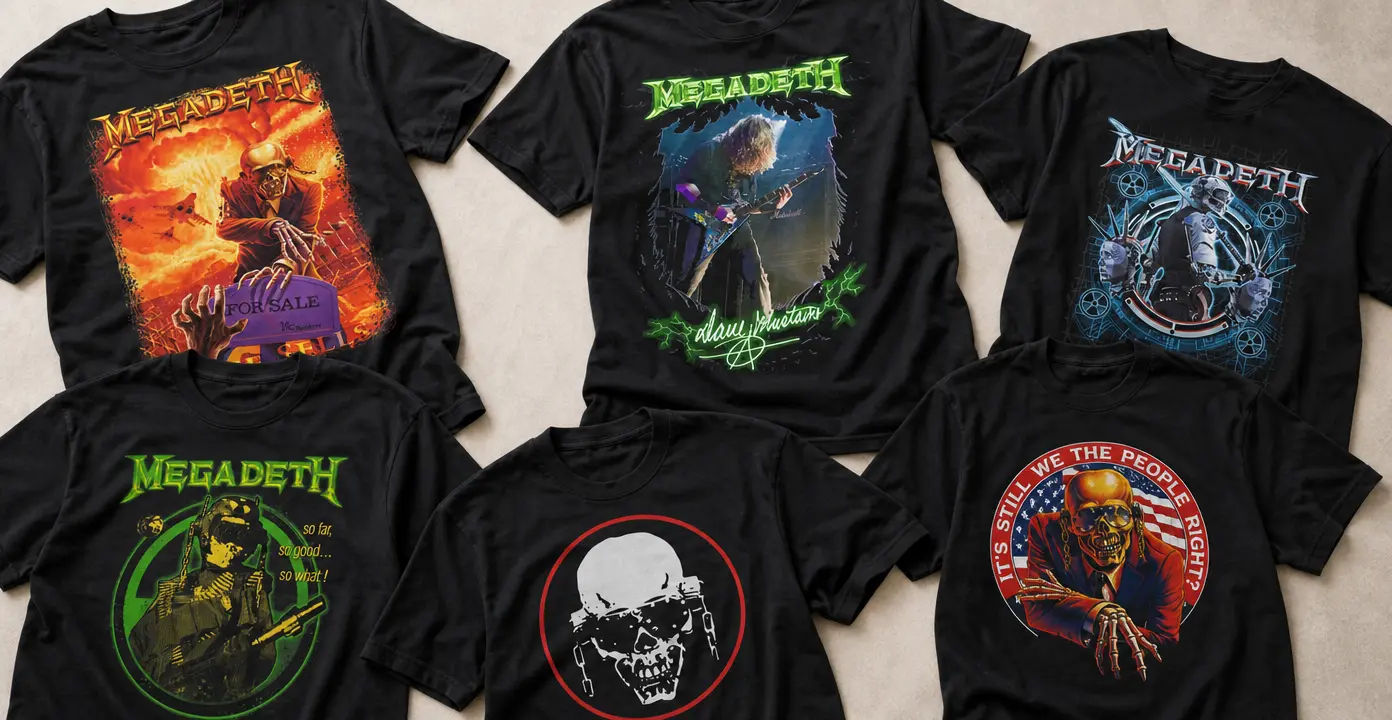
Megadeth Shirts
Megadeth shirts translate the band’s precision-driven thrash metal into angular logos, album-era artwork, Dave Mustaine performance graphics, and the skeletal figure of Vic Rattlehead. The collection’s visual language moves between nuclear warning symbols, military and dystopian scenes, political satire, and stripped-back emblems, with black grounds and distressed color giving many designs the character of classic metal prints.

Megadeth


Megadeth


Megadeth


Megadeth

Megadeth

Megadeth

Megadeth

Megadeth

Megadeth

Megadeth


Megadeth


Megadeth

Megadeth

Megadeth


Megadeth


Megadeth

Megadeth

Megadeth

Megadeth

Megadeth

Megadeth

Megadeth imagery built around Vic Rattlehead
Vic Rattlehead is the clearest link across many Megadeth shirt designs. The skeletal mascot can appear as a stark skull emblem or as a character placed inside elaborate scenes involving radiation, war, political theater, or social collapse. His metal restraints and covered senses make him especially suited to the band’s recurring visual language of censorship, control, and destructive power.
The treatment changes the effect. A compact skull inside a circle reads more like a patch or insignia, keeping the composition direct and easy to recognize. Full-front illustrations give Vic a narrative role: politician, soldier, doctor, survivor, or witness to an apocalyptic setting. These larger designs tend to use fiery orange, toxic green, warning-sign yellow, or cold metallic blue against black fabric.
Album eras and thrash-metal artwork
Album-focused Megadeth shirts connect recognizable record titles with distinct graphic directions. So Far, So Good… So What! imagery leans into military figures, weapons, explosions, and rough high-contrast color. Rust in Peace and Countdown to Extinction provide natural reference points for nuclear anxiety and extinction themes, while Dystopia supports a colder technological look built from robotics, machinery, and blueprint-like details.
Other album and song references extend that vocabulary rather than turning the category into a chronological discography. The useful distinction is visual: some prints reproduce dense illustrated worlds, while others reduce an era to a title, symbol, or central figure. Distressed edges, muted inks, and halftone textures can create a vintage concert-shirt effect, but that styling describes the artwork rather than the age of the garment.
Performance graphics, logos, and design scale
Dave Mustaine designs shift attention from Megadeth’s fictional imagery to the physical energy of guitar performance. A photograph or illustrated playing pose, often framed by the angular band wordmark, emphasizes the technical, riff-centered identity associated with the group. Signature treatments and tour-style layouts add a memorabilia-inspired direction without requiring the dense storytelling of mascot artwork.
For a quieter composition, logo-led shirts and small emblem graphics keep the focus on typography or a single skull symbol. Larger rectangular prints are more poster-like, combining the band name, a central character, and a detailed setting. Choosing between them is mainly a question of visual density: minimal marks foreground recognition, while full-front scenes carry the satire, menace, and science-fiction atmosphere that define much of Megadeth’s artwork.