

Rammstein Shirts
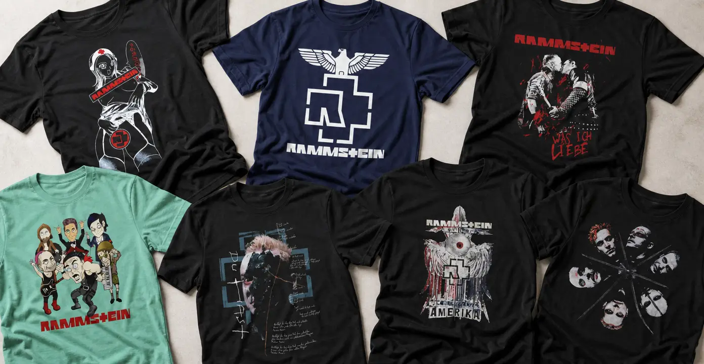
Rammstein shirts translate the German industrial-metal band’s identity into stark logos, album imagery, lyric references, portraits, and stage-inspired graphics. The selection spans restrained geometric emblems, dark artwork connected to Sehnsucht, song-focused designs referencing “Du Hast,” “Angst,” “Amerika,” and “Was Ich Liebe,” plus member and tour themes. Black, white, gray, and red palettes reinforce the severe visual style, while colorful caricatures offer a more playful alternative.

Rammstein

Rammstein

Rammstein

Rammstein

Rammstein

Rammstein

Rammstein

Rammstein

Rammstein

Rammstein

Rammstein

Rammstein


Rammstein


Rammstein

Rammstein

Rammstein

Rammstein

Rammstein

Rammstein

Rammstein


Rammstein

Rammstein

Rammstein

Rammstein

Rammstein
Industrial-metal imagery in graphic form
Rammstein’s visual identity translates naturally into bold graphic shirts. Many designs use rigid lettering, geometric framing, distressed textures, and high-contrast portraits instead of decorative detail. Black grounds paired with white, gray, or controlled red accents create a stark, mechanical appearance. Emblem-led shirts are the most restrained option, keeping the focus on recognizable band symbolism. Eagle, flame, or weathered treatments add more visual weight without shifting attention to a particular album or song.
Album artwork, songs, and lyrics
Album-oriented shirts build around a complete visual theme rather than a logo alone. Sehnsucht designs may feature stark faces, altered portrait details, poster-like compositions, or arranged member imagery. This makes them a strong choice for listeners who prefer record-specific artwork and immediately recognizable portraits.
Song and lyric shirts narrow the focus to an individual reference. Designs tied to “Du Hast,” “Angst,” “Amerika,” or “Was Ich Liebe” can emphasize typography, illustration, portraits, or layered graphic marks. Because the wording forms part of the composition, the amount and style of text change the overall effect. A short title or lyric fragment reads more directly, while a denser layout places greater emphasis on the words and rewards closer viewing.
Band members, performance themes, and graphic styles
Member-focused Rammstein shirts range from individual portraits, including Richard Kruspe designs, to full-group compositions. Distressed or shadowed portraits maintain the darker visual direction found across much of the category. Colorful caricatures provide a clear alternative, using exaggerated features and humor instead of severe monochrome imagery. Choosing between them depends on whether the appeal lies in a specific musician, the full lineup, or a more playful interpretation of the band.
Tour and stage-inspired shirts form another distinct group. Flames, dramatic performance imagery, and stadium-tour references emphasize concert spectacle rather than a record cover. Designs with a city, year, or tour name feel more commemorative, while general stage graphics remain less tied to one event.
For a minimal look, start with a geometric logo and limited color palette. Choose Sehnsucht or another song-related composition when a specific musical reference matters most. Portraits put the performers at the center, caricatures add color and humor, and stage imagery delivers the most theatrical option. Comparing subject, typography, color, and level of detail helps narrow the selection without treating any single design direction as definitive.