

The Doors Shirts – vintage psychedelic rock tees with Jim Morrison art & classic logo
Explore our The Doors graphic tee collection, showcasing retro album artwork, Jim Morrison portrait designs and psychedelic band logos. These soft cotton tees evoke classic 60s rock nostalgia and timeless artistic flair for fans and collectors alike.

The Doors

The Doors

The Doors
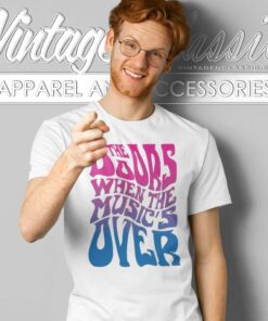
The Doors

The Doors

The Doors

The Doors

The Doors

The Doors

The Doors


The Doors

The Doors

The Doors

The Doors
Discover The Doors Graphic Tees That Channel Psychedelic 60s Rock
Our The Doors category features a curated selection of vintage‑style t‑shirts inspired by one of America’s most iconic psychedelic rock bands. Designs include classic album and concert imagery, Jim Morrison's silhouette, the “Lizard King” motif, and retro band logo art.
Crafted from soft, breathable cotton (or cotton‑blend), these tees often feature vintage washes, faded inks, and period‑style tags that echo the aesthetics of early originals from the late 1960s and 1970s. Collectors frequently seek early ’70s Sanfor‑Knit jackets or Arrowhead tag t‑shirts as indicators of authenticity.
Fans appreciate the subtle wear‑in, minimalist design treatment, or bold lyric‑sheet graphics in album tribute tees that capture the band’s poetic energy and darker lyrical themes.
Ideal for pairing with denim jackets, wide‑brim hats, or vintage streetwear, these t‑shirts appeal to collectors of music history, vintage rock enthusiasts, and fans of artistic band apparel.
Shop now to wear your favorite The Doors design and express the timeless spirit of iconic 60s psychedelic rock culture!